
Table of Contents
A. Company Analysis
B. Banner Ad Designs
C. Social Media
D. Email Design
E. Wireframe
F. Web Page
G. Misc Graphics
H. Summary
A. Company Analysis
Christine MacPhail is a well-established, professional harpist in the Orlando, Florida area. As a small business, she mainly provides harp music for corporate and other specialty events and weddings, ranging from ceremonial music to reception. Besides viewing her current website and Facebook page, I found Christine MacPhail very easily on theknot.com, with an impressive 5-star rating out of a whopping 83 votes. It’s clear from the voters that she is very talented and has a tremendous relationship with her clients. I feel very fortunate to have the opportunity to redesign the campaign.
For the past four months, the importance of an Integrated Marketing Communication (IMC) has been absolutely drilled into me. In summary, having a brand with an IMC means that your messages along all communication channels will be consistent and clear. Doing this will help your brand appear unified, and will help potential clients remember your brand. I have learned that it is especially important to achieve ubiquity in a campaign because it takes “7 different touches” for someone to notice or respond to a brand; being consistent in the ways that a client may come in contact with your campaign (through different sources of media) will create that recognition and trust you need to drive traffic. To learn more about the importance of IMC campaigns, feel free to click here.
Christine’s main clientele are 20-something women planning their weddings. Even though I have never been married and have no personal experience in wedding-planning, these women were my main inspiration for the way I designed her campaign. Because Christine’s business resides in Central Florida, a hotspot for destination weddings and just a beautiful, scenic area in general, I definitely wanted to take advantage of color to attract soon-to-be brides. Elegance, beauty, and romantic: three words every woman wants to exude on her wedding day; three words that could easily apply to the sound of a harp. It was my mission to create imagery that gave off that vibe.
B. Banner Ad Designs
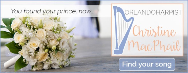
I designed four banner ads for this campaign. I chose to do the same large image throughout of a bouquet with a bridge in groom blurred in the background. I think this imagery would easily catch the eye of a young woman surfing around for wedding inspiration and ideas. I chose the same slogan, “You found your prince, now find your song,” throughout every ad. I purposely used this slogan to market the company for what it is. More than a wedding advertisement, it has to advertise music. You also get a preview of my logo design as well. You can view them below.


Finally, I also designed an animated version of one of the banner ads. I chose to use the leaderboard, because I thought it most visually interesting.
C. Social Media
Social media is such an integral part of a campaign. You can never underestimate the value of reaching out to potential clients through all different channels and giving your clientele the option of how to connect with you. Below you will see that I developed three Facebook cover options, one Facebook timeline image, one Twitter cover option, and one overlay for Instagram. You can view them below.
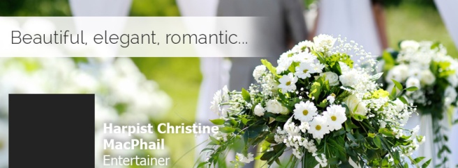


As you can see, I decided to continue with the blurred, mostly green, outdoor theme. Because the business is centralized in beautiful sunny Florida, I thought what better way to showcase what a typical wedding could actually look like. I also mimicked the same overlay banner in white with a lowered opacity, with the same font as in the banner ads, Raleway, in a variety of weights. You can clearly see the similarities between the social media and designs and the banner ads, this goes back to the “integrated” part of the campaign. 🙂
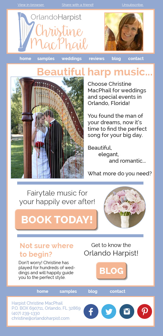
D. Email Design
Next, I created a “Dedicated Email” style e-mail. This means that the email was styled toward someone with a specific purpose: to get them to respond to a call to action. As you can see from this email design, I continued to use wedding-inspired imagery. However, I also wanted to integrate the colors of your new logo design into the email. You can see that I included a promotion to contact you for an event the new person may be interested in. I also added a small tidbit on the bottom for people who may be interested, but have no experience in classical instruments. The result is below.
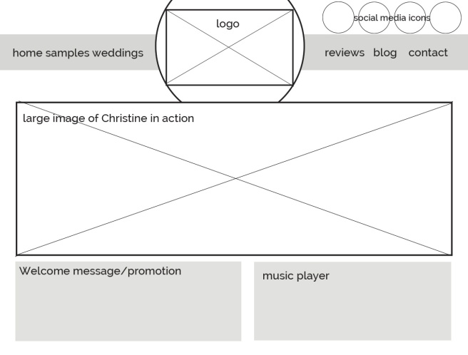
E. Wireframe
From the e-mail design, I dove into the wireframe. This is simply a mock-up of how I envisioned your website to look. It gives you a basic foundation of the concept.
F. Web Page
Following the wireframe, I constructed the actual home page. As you can see more easily, I decided to have a rolling image gallery of photos of you in action, Christine. Your current website has many images of you, and I think it helps to connect potential clientele to a real person instead of a business title. For that reason, I decided to showcase you playing the harp at various venues.
As for everything else, I thought a simplistic, clean design in the logo colors would work best. Of course, I also wanted a music player on the homepage to give clients a taste of your work. (Side note: I love Jason Mraz, so I had to put him first!)

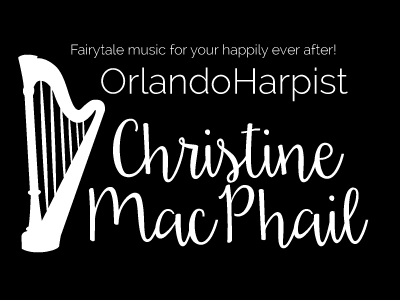
G. Logo Design
Finally, we get to my favorite part: your new logo! I designed this image as a vector, which means it can be transformed to any size without pixelation. I know that you requested a “flowy harp” image, and so I designed a harp in one of Pantone’s new Color of the Years, Serenity, a tranquil blue-purple. I thought it was such a beautiful color and would work perfectly in the music and wedding industry. As I mentioned in my company overview, when I think of a harp, I think of elegance, beauty, and romance. I chose Serenity because it embraces all of that and more.
The secondary color I chose is a beautiful orange-yellow. On the color wheel, orange mirrors blue and purple mirrors yellow, so to offset Serenity I chose this color. Because it is an inviting, warm color, they pair nicely together. They are both vibrant and eye-catching, and I know that any bride-to-be will be drawn to them.
I decided to make your name in a script font called Daydreamer. I was drawn to it for many reasons, but I think it works well again because it looks like an actual signature. I wanted your webpage to feel like an extension of you and your work, and to feel cozy and intimate to invite young women to contact you for your services. “Orlando Harpist” is in the same font used throughout the entire campaign: Raleway, in a variety of weights.
An optional slogan can also be included: “Fairytale music for your happily ever after!”


H. Summary
For additional ideas to promote your integrated marketing campaign, I would highly suggest continuing to utilize your social media on a weekly basis (at the bare minimum). Utilize your channels like Instagram and Youtube with new music.
Many believe that print is a dying media, but I advise you to consider mail and flyers. People like to see things in person, and there are many ways to capture a person’s attention. You could attend bridal shows with goodies, like magnets, pens, or stickers.
This about wraps it up on my end. I hope you enjoyed this potential new design for your business. I sincerely appreciate the opportunity to create this campaign for you.


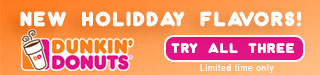
 So, the first thing I did was look for some photos I could easily edit. I found a nice large image with three differently flavored coffee bags and a nice large Dunkin’ Donuts logo. Using the magic wand tool, I deleted the white backgrounds around the coffee bags. Since Dunkin’ Donuts uses bright orange and pink as their colors, I decided to make the background of all of my banner ads a gradient of a bright orange to a slightly lighter orange. I started in the rectangle (it seemed like it would be easiest because of its nearly-square shape) and placed the Gingerbread coffee bag and the logo inside. I managed to find a similar-looking “Dunkin” font on dafont.com, so next I added the type “Introducing… All new HOLIDDAY flavors!” in white with the double “d” in “holiday.” As an avid consumer, I know that Dunkin’ Donuts likes to add the second letter, since it’s their alternate logo. I then created a pink button using the rounded rectangle tool, and added a 3pt stroke. Beneath the button I added a “Limited time only” caption because holiday flavors only last through the end of January (if I remember correctly). Finally, I added a drop shadow to all of the main promotional type and the coffee bag to give the image some depth, and a 1pt black stroke around the entire image.


 I put a small “social media feed” containing their activity on different social platforms directly below the icons because they flow well together.


